As part of my new CUC class, EDT 6050 Using Technology for Effective Decision Making, we’re going to be looking for, collecting, analyzing, and displaying all sorts of education related data in order to make better decisions (you have heard, no doubt, that “data-driven decisions” are the only ones now valid). This means wikiness readers can look forward to my own Excel-based attempts at deriving meaningful information out of realms of data in the weeks to come.

But in the meantime, I can offer two sources that may be good starting points for those looking for data sources on the web. One comes from the Department of Education, The National Education Data Model, a bodacious attempt to bring all the relevant data from school districts throughout the country into one place. This will doubtless make researching local and national quantifiable trends much easier on the educational researcher.

The other is the wryly-titled Chart Porn site, which by its title probably guarantees you won’t be able to view it in school. But its regular postings of interesting data displays make it a useful resource for thinking about how data-based info can be visualized for the visual-learning public.
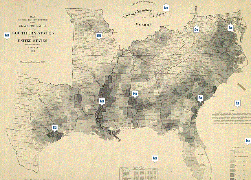 For instance, here’s a capture of an historic chart I found on the latter site–apparently A. Lincoln also loved this data display. It portrays the concentration of slavery at the time of the Civil War. Pretty cool, eh?

Leave a comment