Looked at on the small platform of EDT 6040 “Visual Literacy in the Classroom” at CUChicago, how graphically well-designed is the website of LearnKey’s OnlineExpert.com.? An analysis:
There are many effective design elements being used in this home page for the Excel 2007 training I am doing. Especially, according to my limited knowledge of the principles of graphic design, are the page creator’s use of line, color, and space.
● Notice the way the page’s columns are divided into thirds, the “golden mean” spoken of by Professor Richter. Also linear are the rows and columns of information arranged in the left and right sides of the page. Clearly, the page owners care about order and convention, which are attractive features in provider of professional development.
● Notice also the way in which the colors are muted—the blue not too bright, the red hued more like a pink. I think this may be setting a mood of emotional calm, necessary to doing online training. Color is called “the ultimate tool for symbolic communication,” because it has such power to set mood—the way people feel. “Since feeling is first,” or prior to cognition or thought, it may be thought of as an ur-communication tool. A calm student is able to learn better than an anxious one.
● Finally, notice how there is ample space between the columns of text and at the margins of the pages. This contributes to the atmosphere of calm, which in a corporate training session—the purpose of this page—is very important. A student may feel as if there is “room” for him to grow and make mistakes—part of the learning curve—on such a tranquil page.
What does not get fully effectively utilized, according to my limited knowledge of the principles of graphic design, are the page’s use of texture and size.
● It seems it would be possible, through “texturizing” the surrounding frame of the page, to enhance the feeling of calm already mentioned. The emotional “value” of the page would be increased as a greater contrast was created between the “rough” outside and the “calm” inside of the page. This would require framing the page, and, given my low level of knowledge of the principles of graphic design, might create other issues that would obviate this criticism.
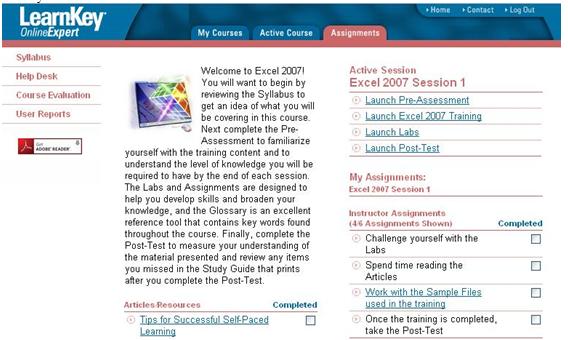
● And it seems it would be possible to enhance the calm of the page user by increasing the size of the calming multi-colored computer screen image. When I managed the production of school publications, there was a theory that for a page to work, one item on it had to be the “CVI,” or “Center of Visual Interest.” This CVI would somehow “anchor” the eye, giving the viewer a sense of perspective, a frame of reference. Without it, a page would somehow lack effect. Of course this was said of newspaper pages, and of yearbook “spreads.” It is perhaps inappropriate to the publication I am critiquing, a webpage.

Leave a comment